How to Track Your Energy Levels (A Practical Guide)
 Image by garetsvisual on Freepik
You have no idea where your energy goes. Not really.
You know you're tired at 3 p.m. You know back-to-back meetings drain you. Some days feel harder than others. But if someone asked you to itemize your energy spending this week, category by category, you'd be guessing. I know because I spent years in that exact position before I started writing things down.
Energy tracking closes that gap. It does for your capacity what a budgeting app does for your spending: turns "I think I'm spending too much" into "$415 on dining out last month."
Why most people never track their energy
It sounds abstract. Money has receipts. Energy doesn't. You can't swipe a card and get a transaction record for that afternoon meeting.
But you can rate it. Not perfectly, but accurately enough to see patterns after two weeks. When I talk to people who tried tracking and stopped, it's almost always one of the same few reasons: they dove in and logged every single minor nuance as a transaction, spent more energy logging than they did doing things, and then burned out on logging; they collected data for a week and never looked at it; or they treated high numbers as failures instead of information.
The 1-10 scale: what the numbers mean
Rate each activity on a simple question: how much of your available capacity did this cost?
Here's roughly how the scale maps out for many people:
- 1-2: Automatic or simple. Checking the mailbox, scrolling their social media feed
- 3-4: These require a bit more attention. Answering emails. Grocery shopping. Commuting.
- 5-6: Focused work. Decision making. A social event that takes effort. This is where things start to feel a bit heavier
- 7-8: High intensity. Difficult conversations. Presenting to a room. Problem solving under deadline.
- 9-10: Rare and heavy. Job interviews. Crisis management. Learning something brand new while already stressed.
These are subjective, and that's fine. If public speaking costs you a 9 and your colleague finds it easy, you're both right. You're building your own baseline, not comparing yourself to anyone.
One way to calibrate: think about what you genuinely do without thinking about it you (that's your 1-2) and what total burnout feels like (that's your 10). Everything else falls somewhere between. I personally find that most of my day lives in the 2-5 range, with occasional spikes. Your distribution will look different.
Pick your categories
Pick the categories you want to focus on to start. Six is a good starting number. Most people get useful data from something like:
- Focused Work
- Communication (email and meetings)
- Home
- Social
- Family
- Creative
Five categories is fine. Ten is fine. The number matters less than whether you can consistently recognize each one when it happens. Note that even on the free tier, you can always enable detailed categories under settings for some more options. Premium tier can make custom categories to match more closely to what they want to follow. If you work in a creative field, split "Creative" from "Focused Work." If you have young kids, use the detailed category "Parenting" its own line. If your commute is a podcast you enjoy, that's worth noting separately from a rush-hour drive.
You can always change which categories you want to focus on later. Start simple and find what works for your interests.
When and how to log
A few options. YNAB trains a lot of people to log immediately when they make a purchase. That kind of discipline works for some people. In tracking your energy, if that works for you, then do it. It is more accurate, but it requires you to actually remember to do it. Or you can do an end-of-day review: five minutes before bed, recall your day, estimate costs. Less precise, but most people find it easier to stick with.
I started with real-time and switched to twice a day: once at lunch and once before bed after about a week. Any way works. The method matters less than doing it consistently.
Commit to two weeks minimum. One week is noise. Two weeks is where the patterns start showing up.
Common mistakes
The biggest one: trying to minimize your numbers. Energy tracking isn't about spending less. High spending means you had a full, active day. That's normal. What you're watching for is when costs shift unexpectedly. If that weekly team sync usually costs a 4 and suddenly costs an 8, something changed. That shift matters more than the number itself. If you're constantly going over what you actually have available for a day, then each log is going to start trending higher as it costs more to borrow energy from the future.
Too many categories is another common one. You don't need to fill in every possible row. Eight to ten gives you enough resolution to see where energy concentrates without turning every log into a decision about which bucket something belongs in.
People also tend to judge their entries, which is the one thing I'd really warn against. If family dinners cost you a 7 and you expected a 3, that's information. It doesn't make you a bad person. It means something about that dinner is more expensive than you assumed, and that's worth knowing.
And if you miss a day, don't quit. Estimate what you remember and keep going. You need enough data to see the shape of your week, not a complete audit trail.
Reading your data after two weeks
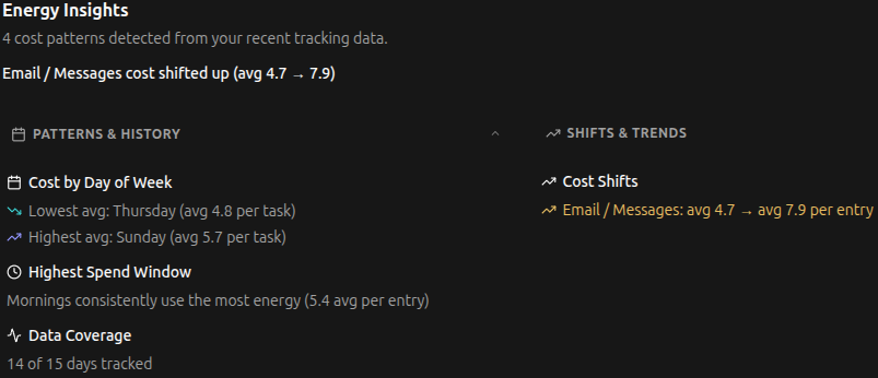
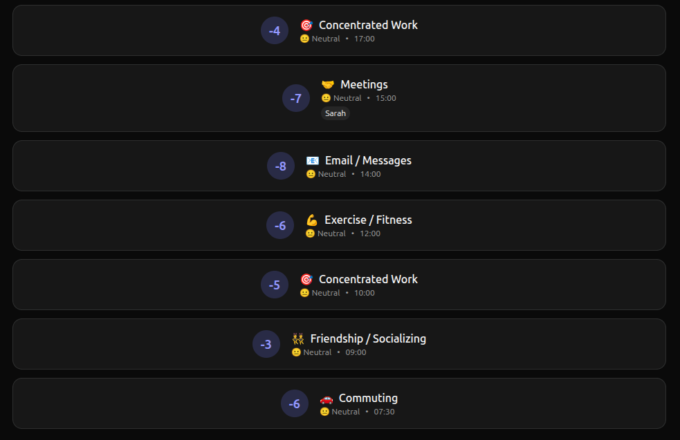
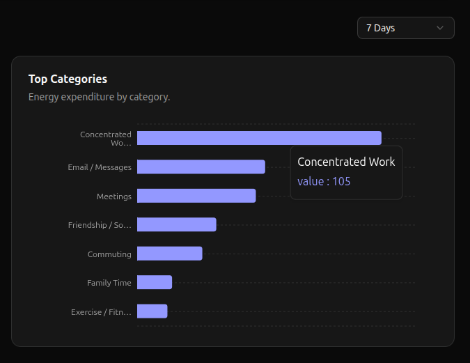
Start with category averages. If Meetings averages 5 for you, that's your baseline. The week it jumps to 7, you know something changed and you can ask yourself what.
Then look for surprises. Maybe social events cost less than you expected. Maybe email costs more. In my experience, almost everyone has at least one category that's way off from what they assumed. Those gaps are usually the most interesting part of the first two weeks.
Day-of-week patterns show up quickly too. Do Mondays cost more than Fridays? Is there a day where routine tasks cost less because you're better rested?
And add up your weekly total. If your typical week is 180 points and you just hit 250 two weeks running, you're in overdraft territory.
A spreadsheet with four columns (Date, Category, Cost, Notes) is enough to see all of this.
Skipping the spreadsheet
You can use any spreadsheet, or start free in Bounded Self and skip the setup. It's a personal energy tracker built for exactly this: you log costs per activity, and the app handles categorization and pattern detection for you. Ten default categories on the free plan that's not a trial. Just free.
If you later want budgeting (set a weekly target per category and track against it, YNAB-style), trend reports, a journal, or custom categories, the premium plan is $6 a month.
Either way, what you're after is the same thing: a clear read on where your energy actually goes. Once you have that, the decisions get easier.
Start this week
Pick your categories, pick a logging method, and give it two weeks. That's genuinely all it takes. By week two you'll know which activities cost more than you assumed, which days are consistently harder, and probably at least one thing that surprises you.