Your First Week
Welcome to Bounded Self
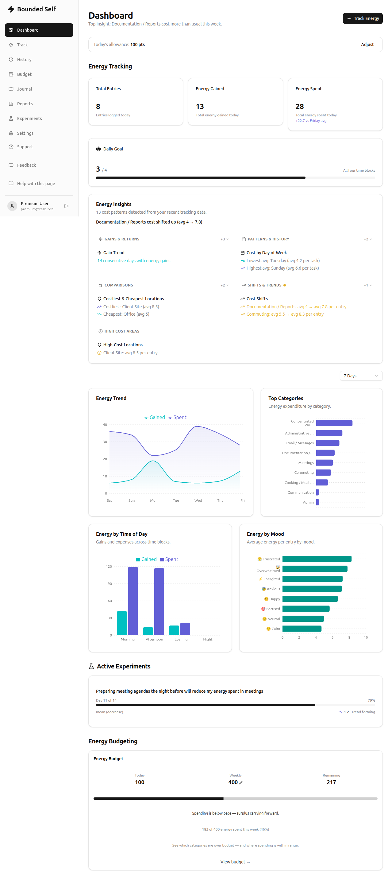
Your dashboard is your daily command center. It surfaces the metrics that matter most so you can understand where your energy goes and so you always have a clear picture of your day.
What you'll see on the dashboard
- Daily stats – a quick count of today's entries, energy gained, and energy spent.
- Habit goal progress – a bar that fills as you log entries toward your daily target.
- Insights card – compares today's numbers against your 7-day average with trend arrows, highlights cost shifts, high-cost categories, and patterns.
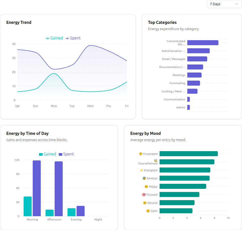
- Energy trend chart – a 7-day area chart showing gains versus expenses by day.
- Category breakdown – a horizontal bar chart showing which categories consumed the most energy.
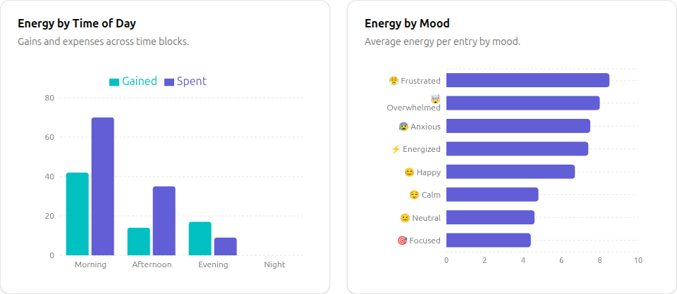
- Mood distribution – your mood patterns throughout the day.
- Time-of-day chart – energy use across morning, afternoon, evening, and night.
Getting the most out of your dashboard
- Log consistently. The more entries you create, the richer your insights become. Even a single entry per day is a great start.
- Set a habit goal. A card on your dashboard lets you choose a daily entry target, or set one in Settings. The progress bar tracks how you're doing.
- Check your trends. The 7-day chart helps you spot patterns – for example, weekdays that consistently drain you or weekends that restore you.
Premium features on the dashboard
If you upgrade to a premium plan, your dashboard also shows:
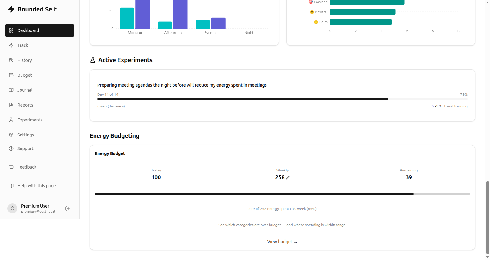
- Energy Budget widget – your weekly budget status, remaining allowance, and a progress bar.
- Active experiments – cards for any running experiments showing progress, per-measure deltas, and confidence indicators.
Related
- Tracking Energy – learn how to log entries
- Energy Budgeting – plan your weekly energy spend
- Running Experiments – test whether a change in routine shifts your numbers
- Plans & Pricing – compare free and premium features
- Getting Set Up – the onboarding flow explained