Understanding Your Insights
How Insights Work
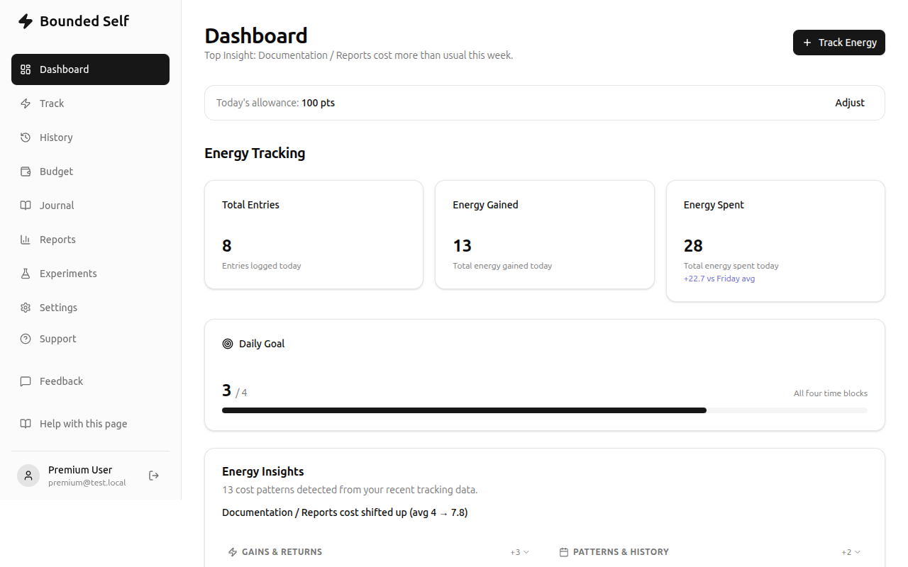
The Insights card on your dashboard is where Bounded Self turns raw entries into actionable observations. Rather than asking you to analyze charts yourself, the system watches for patterns and surfaces them in plain language.
What gets surfaced
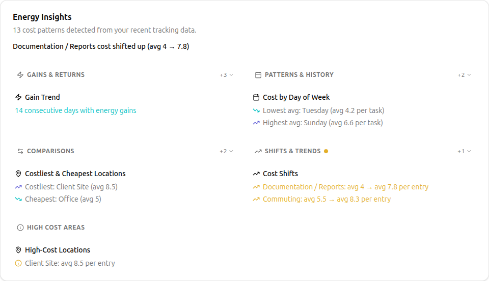
- Cost shifts: when a category that normally costs you 3 suddenly costs 7, the system flags it. The insight is in the delta, not the absolute value.
- Gain streaks: consecutive days where a category consistently restores energy. Worth noticing so you can knowing what reliably restores energy is useful information.
- Drain windows: time-of-day patterns where your expenses cluster. If afternoons consistently cost more, you can plan lighter tasks then.
- Best vs. worst days: days when routine tasks cost less effort (best) versus days when the same tasks cost more (worst). It's about effort per task, not total volume.
- High-cost categories: categories that consistently score 8, 9, or 10 are genuinely draining and worth highlighting.
Reading the insights card
Each insight shows:
- A brief description of what changed or what pattern was detected.
- The relevant numbers — today's value versus your 7-day average, with a trend arrow.
- A grouping label so related insights cluster together (e.g., all cost-shift insights appear under one header).
You can expand or collapse insight groups to focus on what matters most to you.
What to do with insights
- Notice the shift. The first step is awareness — something changed.
- Check context. Look at your recent entries for that category. Did something unusual happen?
- Decide whether to act. Not every shift needs a response. A one-off spike after a bad night's sleep is different from a three-week trend.
- Use budgets or experiments. If you want to test whether something affects a pattern, set a budget target or run an experiment to test whether a specific change helps.
Premium insight depth
Free users see basic trend comparisons: today versus your 7-day average, with trend arrows showing direction. Premium unlocks deeper pattern analysis: location and people-based patterns (is the office consistently more expensive than home?), longer historical windows up to 1 year based on the amount of data entered, and weekly summary digests that highlight what shifted and what held steady. The result is a more complete picture of where your energy goes, and whether the changes you're making are actually showing up in the data.
Is there something you'd like to see for insights? Submit a feedback ticket and let us know. We're happy to consider feature requests.
Related
- Your First Week: where insights appear on the dashboard
- Energy Budgeting — act on insights by setting budget targets
- Running Experiments — test whether a change actually helps